
AI summary of the project
Ask your AI to summarise this project, then explain why it succeeded and what could be applied to your own website.


Three worlds on a single page
Agence 3XL is a unique company, founded by Gérald Debaud, that brings together three distinct activities: a professional podcast, a mentoring service and a broadcasting offer. The challenge was not just to create a beautiful landing page. These three worlds had to be presented on a single page, without losing the visitor or diluting the message.
This kind of project is more complex than it looks. When a brand carries several offers or several angles, the risk of producing a confusing page is high. Visitors no longer really know what they are looking at, who it is for, or what the main proposition is. The whole difficulty was to create clarity, consistency and conversion from a potentially very rich whole.
A simple goal: clarity, consistency, conversion
From the start, the goal was set very clearly: build a page that helps people quickly understand the three pillars of the project while keeping a premium perception. The site was not supposed to look like a series of stacked blocks. It had to work as a continuous experience, with an obvious reading logic.
The landing page also had to be commercially useful. A brand or service page only has value if it helps move the business forward. Here, the structure had to let a visitor understand, buy in, and then book a meeting without hesitation. Conversion was at the heart of the project, not a secondary layer.
The groundwork
The first step was to clarify the relationship between the three worlds of Agence 3XL. The professional podcast, the mentoring and the broadcasting were not supposed to appear as scattered offers. On the contrary, they had to feel like parts of one vision. This groundwork is often invisible once the site is live, but it is decisive. Without it, the page stays fragmented.
So we organised the messages so that each block reinforces the whole. Visitors had to feel a unified brand, able to carry several dimensions without confusion. That is what keeps a multi-offer landing page readable and effective.
Clean, modern and lively design
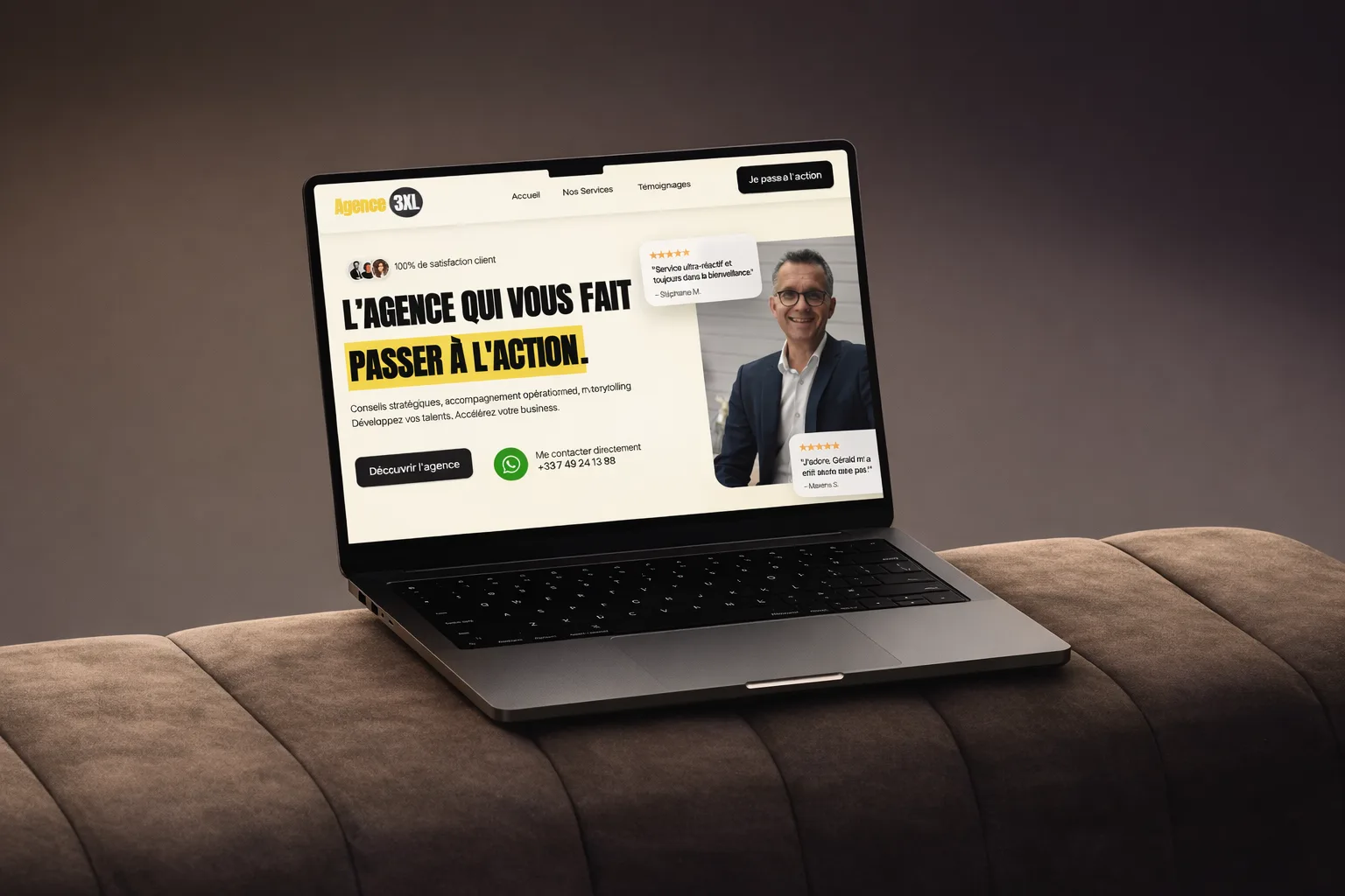
Agence 3XL's design relies on a simple, fluid and premium direction: a clear visual hierarchy, precise CTAs and light animations. The goal was not to add decoration but to support reading and make navigation livelier, without losing the restraint a multi-offer brand needs.
On this kind of page, visual balance matters a lot. Too little rhythm and the page feels flat. Too many effects and it becomes confusing. So we aimed for a sense of control: a design minimal enough to let the message breathe, but refined enough to give the brand a real online presence.
A landing page designed as an experience
The page was designed as a journey. Visitors should never wonder why they are reading a given section. Each block had a clear intention: understand the company's identity, identify the three worlds, feel guided, then move to a concrete action. This progression is what turns a clean page into an effective one.
The copywriting followed the same logic. The wording had to be sharp, with no overload, no jargon and no dilution. The more dimensions a brand carries, the more precise the text must be. Here, clarity was the condition for conversion. That is why we chose a direct, readable and structured voice.
Concrete results and a business signal
The result was not only visible in the consistency of the page. It was also measured very quickly in use. Three meetings were booked on launch day. This kind of signal confirms something simple: when a page is well thought out, the difference shows quickly.
Beyond these meetings, the site gives Agence 3XL a clearer, more consistent and more impactful online identity. That is often what hybrid companies lack. They have value, but not always the digital presence able to make it readable. That is exactly what this project fixed.
Local SEO and relevant positioning
The content was also designed to support the project's SEO readability. The page had to link the brand more clearly to Annecy, to the world of coaching and support, and to its different services. We kept the wording clean, without stuffing the page with artificial terms.
When positioning is well structured, SEO benefits naturally. A clear, well-organised and well-named page sends better signals than a vague page that tries to say everything. This underlying consistency is what lets the landing page perform better over time.
Results
- 3 meetings booked in the first week after launch
- PageSpeed score: 96/100 mobile — a smooth experience
- Load time: < 1s
- Delivery: 21 working days
- Total size: < 300 KB — no unnecessary libraries
What the client says
“A superb experience, with sound advice from Maxens, who brings all his creative and positive energy. The landing page is stunning. We highly recommend him!”
Deliverables
- Custom landing page
- Clear visual hierarchy
- Clean, modern design
- Precise CTAs
- Light animations
- Conversion structure
What this project shows
Agence 3XL proves that a simple page can be very powerful when it is well thought out. Real sophistication is not about piling things up. It is about making a complex project clear, consistent and memorable.
This case study is a reminder of something essential: well-built simplicity is often what turns a brand into an experience. That was the whole challenge here. Bringing three worlds together on a single landing page, without confusion, with style and with a real business result. That is what was delivered.