
AI summary of the project
Ask your AI to summarise this project, then explain why it succeeded and what could be applied to your own website.


Starting point
Maxime Sciare already had the foundations of his positioning. His expertise was real, his offer existed, and his message was clearer in his head than on his website. So the problem was not a lack of substance, but a lack of alignment between the real value on offer and the perception created online. This is very common among demanding coaches, consultants and freelancers: the website ends up underselling what they can really do.
In this context, the redesign was not just about refreshing the look. It had to bring order to the message, reorganise the information and restore consistency to the whole. A good coach's website cannot rely on vague wording. It must help visitors understand within seconds the nature of the coaching, who it is for and the level of professionalism they are dealing with.
The initial problem
The previous site did not support Maxime's credibility enough. The offer seemed less clear than it really was, and some parts of the page left too much room for interpretation. In coaching professions, that ambiguity is costly. If visitors do not clearly understand what is offered, they do not book a meeting, even if the expertise is there.
The way the positioning was expressed also needed work. A professional coach and speaker cannot afford a generic digital presence. His website must make his uniqueness, his stance and his ability to support people visible. A serious redesign therefore means real work on the message structure, not just on colours or fonts.
Goal of the redesign
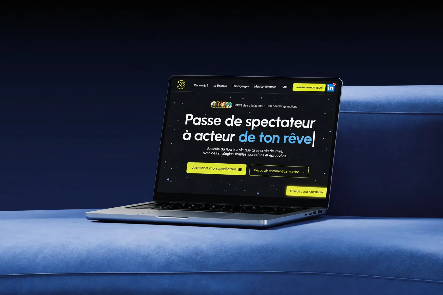
The goal was to deliver a clearer, more premium and more convincing website. In practice, that means several things: a better reading of the offer, more intuitive navigation, a sharper information hierarchy and a more accurate editorial tone. The page had to help Maxime present himself better, but also guide prospects better towards getting in touch.
We treated the project as a strategic redesign, not a cosmetic facelift. Visitors had to understand from the first read what Maxime does, for whom, and in what kind of dynamic. This clarity matters for both conversion and SEO. When the page names the activity, the services and the uses better, it performs better on both fronts.
Restructuring the offer
The most important work concerned the editorial restructuring. Some information needed to be moved, some rewritten, and some simply tightened. The goal was not to say more. It was to say it better. So we reworked how the coaching, the coach's stance, the value of the talks and the reasons to get in touch are presented.
This step is often decisive. Many freelancers' websites lose impact because they stack sections without any real logic. Here, we aimed for a more natural progression: clarify the promise, establish credibility, explain the offer, then guide towards action. When this logic is well built, the site breathes better and visitors move forward without asking themselves needless questions.
Copywriting and premium perception
Rewriting the copy removed the vague areas and strengthened the message. The site had to feel sharper, more controlled and more aligned with Maxime's real level. Good copywriting is not text that overdoes it. It is text that makes the proposition more obvious.
We favoured a simple, direct and credible tone. Readers should not feel they are reading a standard coach website, interchangeable with ten others. On the contrary, a personality, high standards and a real ability to support people had to come through. This difference lies largely in the wording, the choice of words, the length of sentences and the way proof is organised.
Design, rhythm and user experience
The design of Maxime Sciare's website was completely reworked to strengthen the premium perception and support reading: more space between blocks, a sharper visual hierarchy, a more relevant selection of components and a clearer link between proof, offer messages and calls to action.
The user experience was also simplified. Visitors must understand effortlessly, browse the site without friction and quickly identify the next step. A coach's website that reads easily inspires more trust. It is not an aesthetic detail. It is a direct conversion factor.
SEO and semantic consistency
The project was designed with an SEO angle suited to Maxime's activity. The site had to carry the themes of professional coaching, one-to-one support, public talks and personal positioning better. So we strengthened the consistency of the messages around these topics, while avoiding over-optimisation.
This work makes the site more readable for Google while staying natural for visitors. It is often the best approach on an expert's business website: clear wording, accurate words, a clean structure and no needless tricks. The more consistent the page, the better it performs over time.
Technical results
- PageSpeed score: 96/100 mobile after the redesign
- Performance gain: +40 PageSpeed points vs the old site
- Delivery: 21 working days
- SEO: topic cluster structure + Person schema
What the client says
“I asked Maxens to rebuild my website at a time when I needed clarity. In less than a week, he fully understood my needs and proposed a clear, effective design. The result is outstanding and I received positive feedback from launch day.”
Deliverables
- Complete redesign
- Restructuring the offer
- Custom copywriting
- Conversion-focused design
- Simplified user journey
- Fast launch
What this redesign changes
The new site gives Maxime a more accurate image. It conveys his value better, clarifies his offers and makes getting in touch more natural. That is the difference between a website that exists and one that truly supports a positioning.
This case study shows that a well-run redesign is not about adding a new visual layer. It is about bringing clarity where there was confusion, and rebuilding a website that serves the real business. For a professional coach, that is often what improves perception, flow and impact.