
AI summary of the project
Ask your AI to summarise this project, then explain why it succeeded and what could be applied to your own website.


Context of the beta project
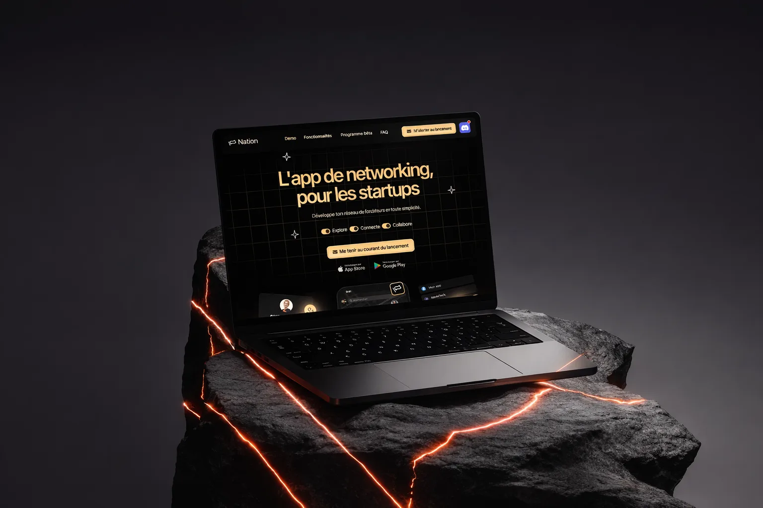
Nation was preparing the beta release of its networking app for startups. The project was not yet at the stage of a full public launch. So we had to design a page able to support a very particular step: present the app seriously, build a strong product perception, and capture the interest of the first users before the wider release.
In this kind of context, the landing page is not just about the product. It validates the launch momentum. It must make the app tangible, reassure about its maturity and make people want to join the beta or follow the project closely. The work had to be precise: not too broad, not too technical, not too conceptual.
The main risk: abstraction
For an app in beta, the main danger is that the page stays too vague. If visitors do not quickly understand what the app is for, who it is designed for and why the beta deserves their attention, they leave. With Nation, we had to reduce this abstraction as much as possible. The positioning had to be understandable from the first seconds.
Another important point was credibility. A beta can quickly give the impression of a fragile project if the page does not carry the product well enough. The site had to send the right signal: yes, the project is in beta, but no, it is not half-baked. On the contrary, it had to feel like an already structured product, with a vision, a world and a clear proposition.
Goal of the pre-launch landing page
The goal was to build a beta pre-launch landing page able to capture attention, explain Nation's promise and direct visitors to the most logical action. That action could be a download, a sign-up, following the project or finding out more, but in every case it relies on the same condition: the page must turn curiosity into real interest.
So we designed the site as a traction tool. It had to support the beta phase, give the product a real presence and set a premium tone from launch. The more control the page conveys, the more it helps people see the beta as an opportunity to get into the project early, not as an uncertain trial.
Copywriting for a digital product
The copywriting followed a logic of maximum clarity. It had to speak to the startup world, but without needless jargon. The wording had to make the app tangible, explain what it is for and show why Nation's networking can appeal to founders, entrepreneurs and players in the startup ecosystem.
We aimed to simplify without impoverishing. The page had to get straight to the point while keeping enough substance to inspire trust. Each section was therefore designed as a step in a persuasion funnel: grab attention, clarify the proposition, show the interface, build a premium perception, then push to action. That structure is what makes a beta landing page perform better than one that is too descriptive or too abstract.
Design and product perception
The art direction was designed to support the technological and premium side of the project. Choosing a darker, more controlled look made the product stand out and gave it a modern feel. For a beta app, this is very useful: the design helps prove the project is already taken seriously.
The visual structure was also simplified to make mobile reading easier. A sharp hero, visual demos, well-ordered blocks and well-placed CTAs. The idea was to keep a frictionless journey, able to convince quickly without overwhelming visitors. On this kind of page, too much information often kills conversion. The right strategy is to clearly order what matters.
SEO strategy for an app in pre-launch
The SEO work was designed to match the reality of the project: a networking app for startups in beta. So we built wording around the startup world, mobile apps, networking, digital products and pre-launch. The aim was not to over-optimise, but to give the page a clear context.
This semantic consistency works on two levels. It helps Google understand the nature of the project, and at the same time helps visitors quickly identify what they are looking at. When the page names things accurately, SEO and conversion move forward together. That is exactly what we were after for Nation.
Results
- 350+ beta testers signed up within 1 week of launch
- PageSpeed score: 98/100 mobile — instant rendering
- Load time: < 0.8s (Largest Contentful Paint)
- Delivery: 12 working days
- Responsive coverage: 100% mobile-first, tested on 8 screen formats
What the client says
“I worked with Maxens on our landing page and he immediately grasped what we needed: a page that converts. Extremely responsive, always listening, and a result perfectly aligned with our expectations.”
Deliverables
- Beta pre-launch landing page
- Digital product copywriting
- Premium art direction
- Conversion-focused structure
- Mobile-first journey
- Clean SEO foundation
Why this landing page matters
Nation's landing page was not there to support a classic final launch. It was there to give strength to a beta phase. That is an important nuance, because a beta must be appealing while staying credible. The site therefore had to find the right level of maturity in presenting the product.
This project shows that a pre-launch page can be a real lever when it is well thought out. It makes the project tangible, builds a stronger image and prepares a more ambitious next step. For Nation, the landing page did not just need to exist. It already had to start doing the job of a real launch tool.